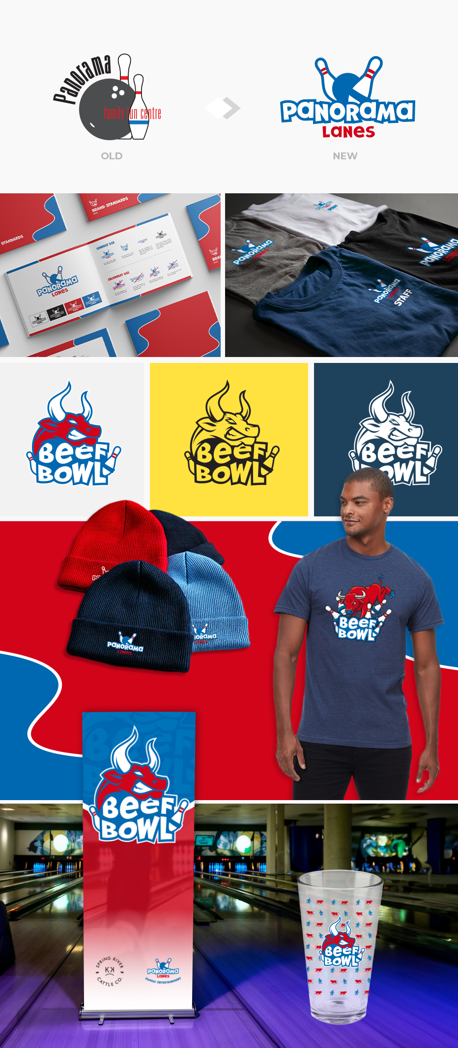
Logo Design
Brand Guidelines
Tournament Logo Design
Custom T-Shirt Design
Signage Designs
Apparel & Merch
Under new ownership the client wanted to rebrand their logo to something more recognizable and fun. The design needed to represent both 5-pin and 10-pin bowling, while being welcoming and exciting enough that people would actually want to wear it. The client also required a design for a new bowling tournament they host. Both logos needed to work as one colours and be flexible to work in small applications as well as large for print and web.
After a comprehensive creative brief with the client, logo concepts were sketched out on paper and further refined on the computer. 3 logo concepts were presented to the client with brand guidelines completing the project. Retractable banners were designed as new signage for the bowling alley and tournament. Apparel items were sourced for employee uniforms and merch to buy. Custom pint glasses and a t-shirt design was also created for the client to sell at the tournament.